How to Test if Your Website is Mobile-Friendly | Module 5.1
A website that looks great on your laptop might be clunky on a phone. With more than half of web traffic now coming from mobiles, this matters.
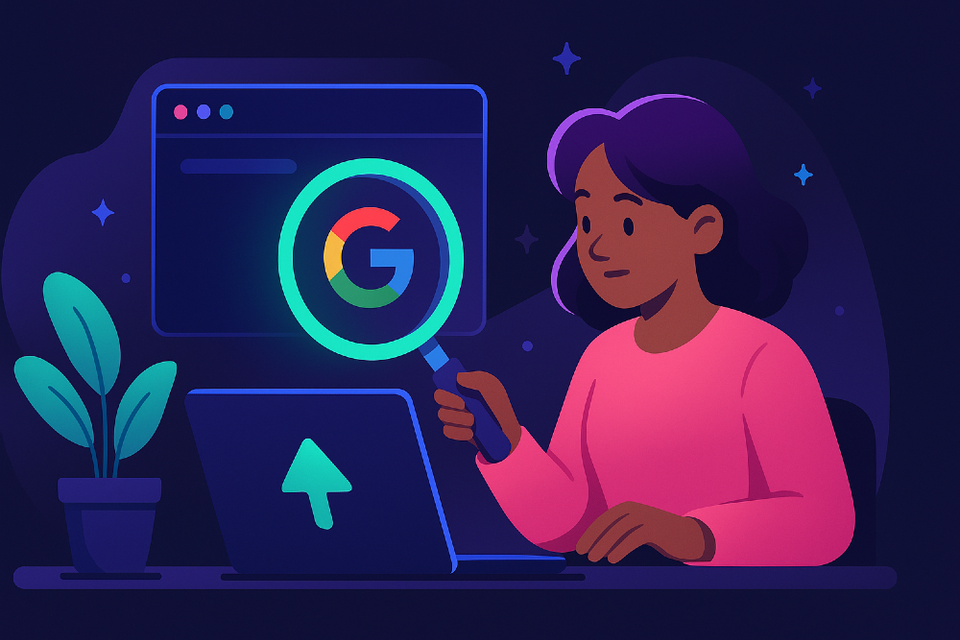
Check Your Site’s Mobile-Friendliness with Free Tools
Over half of all web traffic comes from mobile devices. Google uses mobile-first indexing, meaning it looks at your mobile version first when ranking your site.
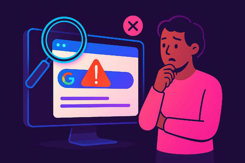
If your site isn’t mobile-friendly, you could be losing visitors and visibility.
The good news? You can test and improve your mobile experience in minutes—no coding needed.
Step 1: Test with Lighthouse or PageSpeed Insights
Do this
Google retired its old Mobile-Friendly Test. Use Lighthouse (built into Chrome) or PageSpeed Insights instead.
Using Lighthouse:
- Open your site in Chrome
- Right-click → Inspect → Lighthouse tab
- Set Mode = Navigation and Device = Mobile
- Click Analyze page load
Using PageSpeed Insights:
- Visit pagespeed.web.dev
- Enter your site URL
- Review the Mobile report for Core Web Vitals and accessibility issues
✅ Check this worked:
Look for your Core Web Vitals (LCP, INP, CLS) and confirm there are no major mobile issues.
Why this matters:
Google ranks based on mobile usability first.
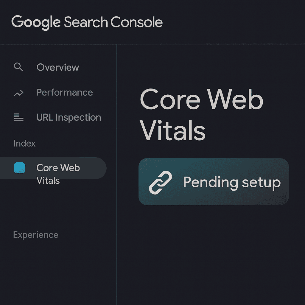
Step 2: Check in Google Search Console
Do this
If you’ve set up Search Console:
- Open Performance → Search results → Device: Mobile
- Check which pages get low mobile clicks
- Go to Experience → Core Web Vitals (Mobile)
- Review slow loading or layout shift issues
✅ Check this worked:
Use URL Inspection → Test Live URL to see how Googlebot renders your page on mobile.
Why this matters:
This shows how Google actually sees your site, not just users.
Step 3: Preview on Real Devices
Do this
Test how your site looks and feels across different screens:
- Responsinator (optional visual tool): Preview how your site looks on common mobile devices like iPhones and Androids. – see your site on iPhones, Androids, tablets
- Chrome DevTools: Right-click → Inspect → Toggle device toolbar
- Try real phones too—scroll, tap menus, and test buttons
✅ Check this worked:
If text is readable, buttons spaced, and menus easy to tap—you’re mobile-friendly.
Why this matters:
If it feels awkward on your phone, visitors will leave.
Step 4: Fix Common Mobile Issues
Do this
Start with small, high-impact fixes:
- Use a responsive theme so layouts adapt automatically
- Increase font size to 16px minimum
- Space out buttons and links
- Compress images for speed
✅ Check this worked:
Retest with Lighthouse or PageSpeed Insights—your score should rise.
Why this matters:
Speed and readability directly affect bounce rates and conversions.
Step 5: Ask a Real Person to Try It
Do this
Send your website to a friend or colleague and ask:
“Can you find the contact page?” or “Can you buy this product?”
✅ Check this worked:
If they can complete the task easily, you’re mobile-ready.
Why this matters:
Real users notice what tools can’t.
Quick Win Summary
Testing mobile-friendliness only takes a few minutes, but it makes a big difference.
Use Lighthouse, PageSpeed Insights, and real-world testing to find issues fast.
Small improvements in speed, layout, and readability can lead to more visitors and more conversions.